ROLE
Creative direction & graphic design
Creative direction & graphic design
THE CLIENT
Two Turtle Doves is an online Small Business Academy run by mother and daughter power-duo Lowen Partridge of Peartree Brand Strategy and Jacqui Brown of Stellar Marketing.
Two Turtle Doves is an online Small Business Academy run by mother and daughter power-duo Lowen Partridge of Peartree Brand Strategy and Jacqui Brown of Stellar Marketing.
OVERVIEW
Already strongly-established within the Adelaide marketing scene, I worked closely together with Lowen and Jacqui to develop the brand for their new business venture.
Already strongly-established within the Adelaide marketing scene, I worked closely together with Lowen and Jacqui to develop the brand for their new business venture.
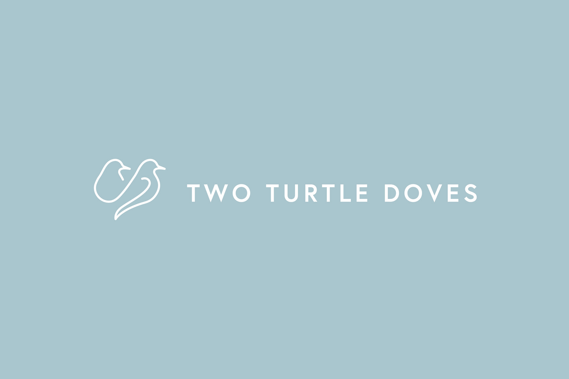
They wanted the logo to feel contemporary, fresh, approachable and sophisticated whilst reprepresting learning, client care, honesty, technology and reliability. The logo needed to be responsive so it could be easily recognised even at a small size due to it’s digital application - ensuring a comprehensive user experience across all devices.
The resulting logo features Two Turtle Doves drawn using a single line, which represents the strong connection between mother/daughter and teacher/client.
Tags: Branding, Logo design,
Logo design
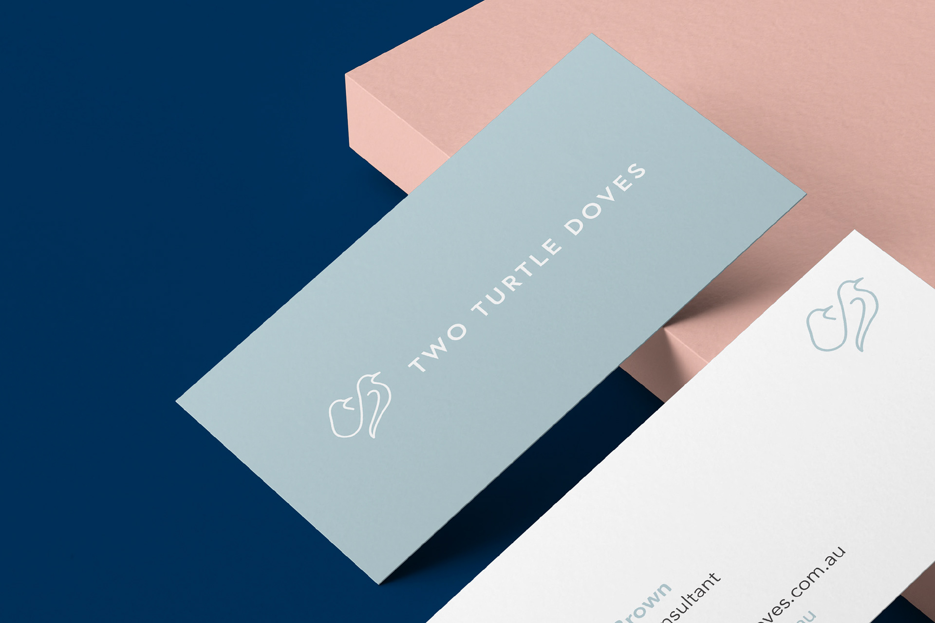
Business cards


Brand elements
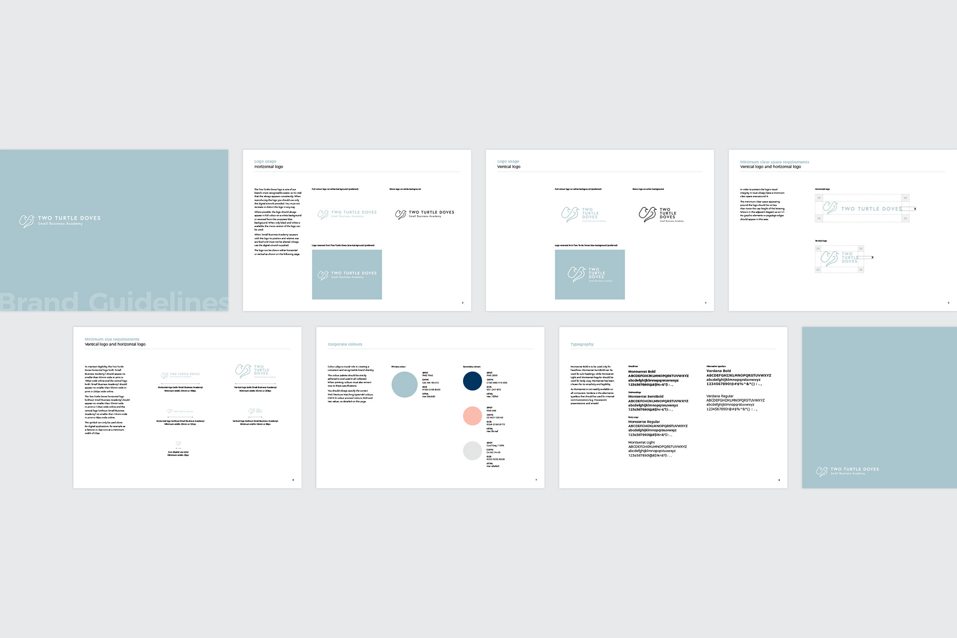
Brand guidelines
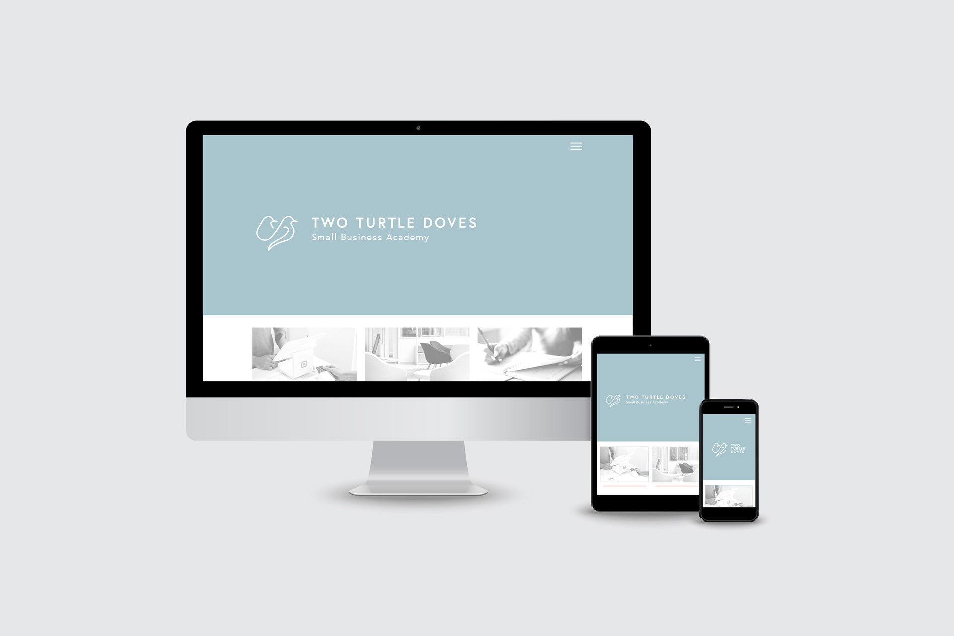
Landing page design
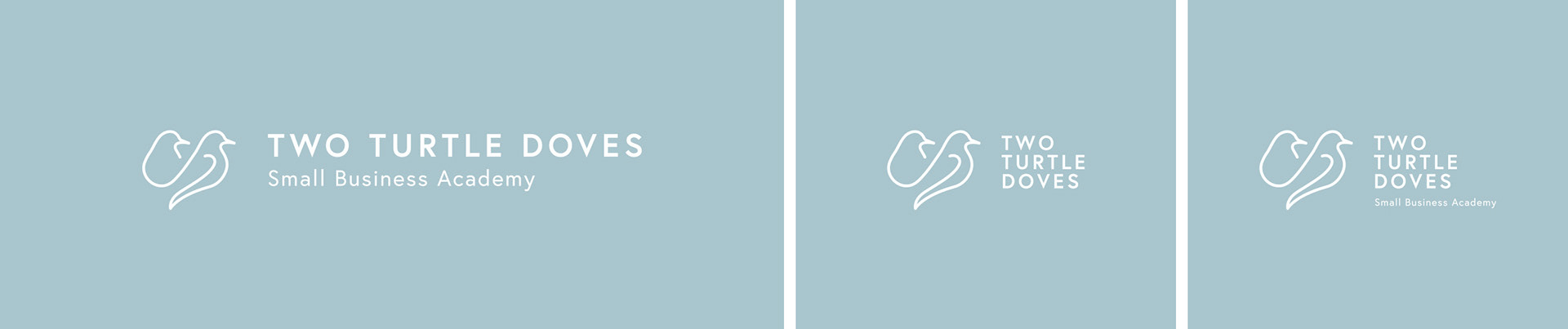
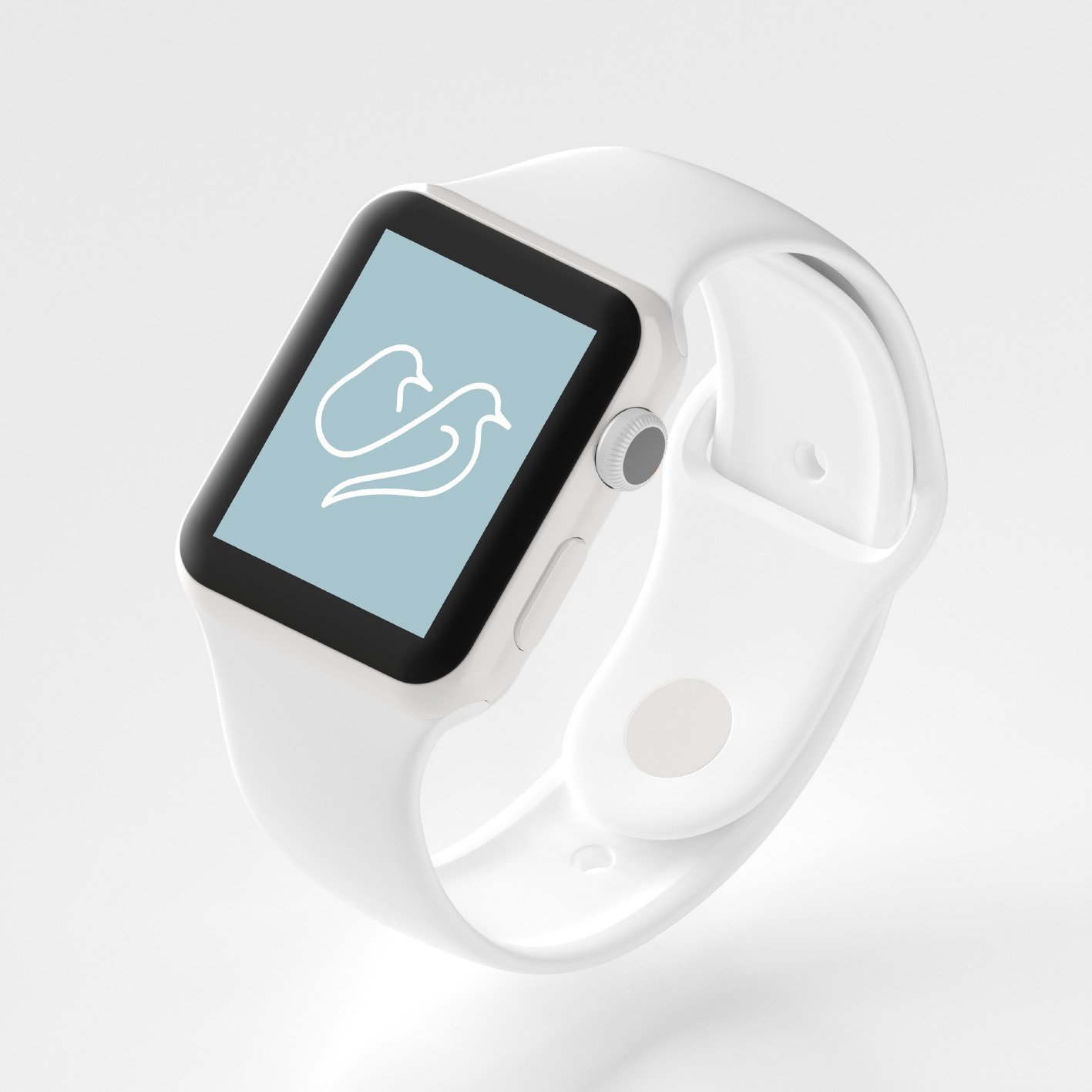
Responsive logo variations